
What is a knitting chart?
A knitting chart is a visual way of presenting a knitting pattern. Unlike traditional knitting patterns that describe how to create the fabric using text, knitting charts use graphical symbols to represent stitches, and the choice of symbol usually gives a good indication of the stitch it represents. This makes it much easier to check where you are in a pattern and to find mistakes.
Common principles
Although there is no formal standard for knitting charts, there are some principles that are almost always followed.
Always read what the symbols mean. The meanings of symbols are not always the same. Check the key and instructions in the pattern to find out how to interpret the chart.
The chart always represents what the fabric will look like from the public side. Charts always have the first row (or round) described by the chart at the bottom of the chart. As you knit more rows or rounds you move up the chart. This means that you can compare what is on the chart below the row or round you are knitting with the fabric you have already made. It does not matter whether you are knitting bottom-up or top down – the bottom of the chart is always knit before the rows above it.
Each symbol on the chart covers the same number of grid boxes as there are stitches to be placed on the receiving needle.
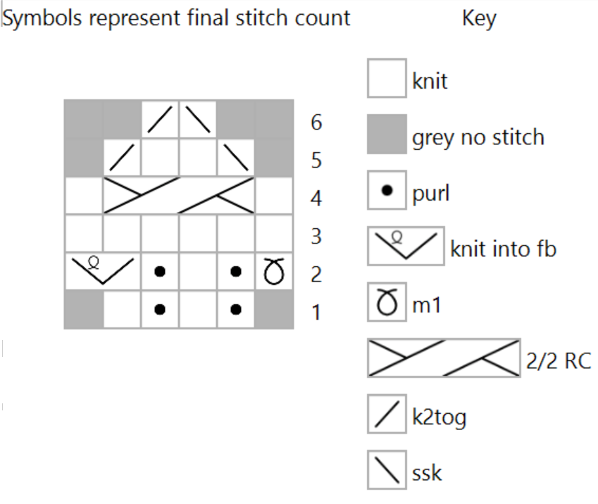
So, the symbol for a knit stitch is one box wide. A symbol for a yarn over is also one stitch wide, because it creates one stitch on the receiving needle. A symbol for a k2tog also occupies one box, because even though it uses two stitches from the previous row (“consumes” two stitches), only one stitch is passed to the receiving needle. A 2/2 cable passes 4 stitches to the receiving needle.
Work from right to left on the chart when working on the public side of your fabric. Your pattern will tell you whether you start on a public (right) or private (wrong) side. Many charts number the public side rows on the right and the private side rows on the left, just to remind you where to start. If you are knitting in the round you always read the chart from right to left for every round. If you are knitting flat (or working short rows within a piece that is mainly knit in the round) read from right to left when working on the public side (rows that in stockinette would be knit) and from left to right when working on the private side (rows that in stockinette would be purl).
Do nothing where the chart says “no stitch”. The aim of a chart is to look like the finished fabric. When the fabric is shaped, such as at an armhole, Starting each round or row in the first would mean that the chart did not look like the fabric. Instead, the chart will keep the columns of stitches continuing as a column up the grid of the chart. . This leaves spaces at the sides of the chart where there are no stitches – and these may be shown as a “no stitch” (or the grid might not be shown in those areas). The neck opening will also be shown as “no stitch” (or without a grid). Lace patterns often change the number of stitches from row to row, and to keep the repeats of the pattern lined up, the shorter rows are padded with “no stitch”. So, when you see a “no stitch” in a chart, just move on to the next real stitch.
The same symbol has different meanings for working on the public side and for working on the private side. A chart looks like the public side of the fabric. The key will therefore give two interpretations for the symbols. One is the stitch to be used when working the public side (often identified by RS) and the other the stitch to be used when working on the private side (WS). So, the chart for stockinette would show the same symbol for every row, but when working on the public side you would knit, and when working on the private side you would purl. This might appear in the key as “RS: k, WS: p”.
Charts are often repeated horizontally and vertically. Traditional Fair Isle motifs are usually much smaller than the fabric being made. Rather than making a chart that might be two or three hundred stitches wide, it is usual to make the chart much smaller and say how many times the sequence is to be repeated along a round or row. In the same way, the chart might be repeated vertically. Charts will often be divided into three sections: an initial section, a section that is repeated (the number of repeats will often be stated), and a final section. The initial and final sections may contain partial repeats of the central section. For example if a row has 130 stitches and the pattern repeat is 30 stitches long, the initial section would consist of the last 5 stitches in the pattern, the pattern would be repeated 4 times, and the final section would have the first 5 stitches. This would make the whole row symmetrical. These repeats are often marked using bold grid lines around the repeated section.
Keeping count of large numbers of identical stitches. Counting a large number of uniform grid boxes on a chart can be difficult. Some designers help the user by writing the number of such stitches on the chart itself so that the user does not need to count them – but, of course, there is still a need to count the stitches as they are knit!
Numbering of rows. Rows in the chart are usually numbered from bottom to top. Charts intended for knitting in the round are numbered on the right (to show that is the side to start a round). Charts for flat knitting are also numbered to help you know which side of the chart to start a row – so (if row 1 is a public side row), odd numbers are on the right and even numbers are on the left. If you see a chart with odd numbers on the left, this is a reminder that you start on a private side row. The symbols on the chart always correspond to the stitch as it looks from the public side, regardless of which type of row starts.
A chart for colour knitting
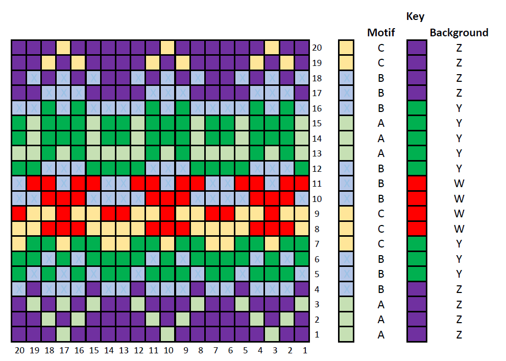
Perhaps the easiest chart to interpret is a colour chart that is published in colour. In this representation, each grid box is coloured to show the colour of the corresponding stitch.
The colours may be close to those of the recommended yarn, but the designer may have used colours that are easy to distinguish instead. You should always refer to the key to see the meaning of the colours. And, of course, if you use your own colour scheme you should update the key to remind you which colour to use. This type of chart is suitable for both stranded and intarsia colour knitting.
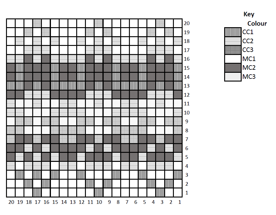
Printing in colour is more expensive than printing in monochrome (commercially, as well as using a domestic printer). People who are colour blind may find it difficult to distinguish colours on a chart. Many patterns, therefore, use monochrome charts.
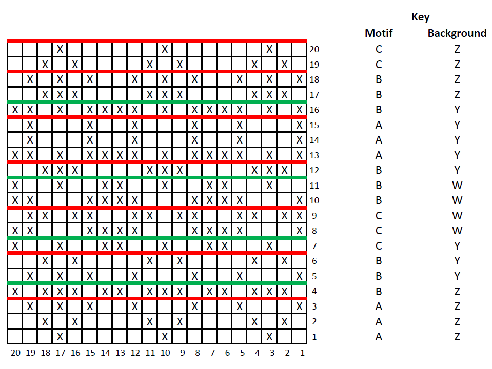
The example monochrome chart shown here uses different types of shading to represent the colours. You may find it difficult to distinguish between the types of shading in this example. Imagine how much more difficult it would be if there were even more colours. This type of chart is suitable for both stranded and intarsia colour knitting.
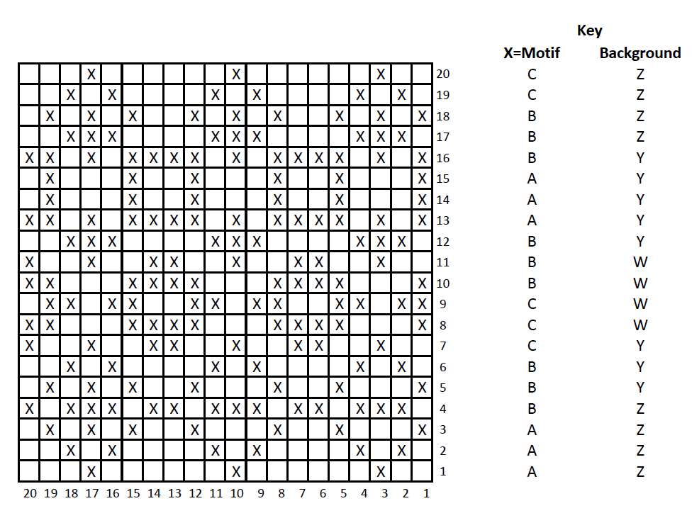
An alternative to using different symbols for each colour is to use two symbols: one for the motif (contrast) colour and the other for the background (main) colour. In the illustration, the motif colour is represented by X and the background colour is an empty box. The contrast and background colours are specified in a key for each round or row.
This approach is easy to read when knitting along a round or row, but care needs to be taken when moving up the chart to make sure that you do not miss a colour change.
This approach is well suited to stranded knitting, where using more than three colours would be cumbersome. It is less suitable for intarsia.
Stitch pattern charts
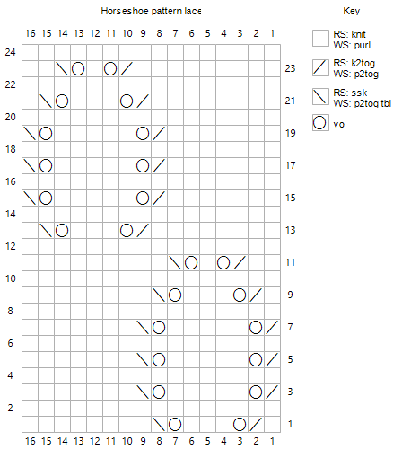
Charts for stitch patterns are particularly common for lace knitting and knitted lace. Symbols represent the stitches to be made.
Each symbol covers the number of stitches that are placed on the receiving needle when the symbol is worked.
The key to the chart tells you which stitch to make for each symbol. There may be two definitions for each stitch – one for working on the public (right, RS) side, and the other for working on the private (wrong, WS) side. The symbol illustrates how the stitch will look from the public side.
Knitted lace refers to open work knitting in which every other row (knit from the private side when knitting flat). That is, these rows are always purled (working flat) or knit (working in the round).
Knitted lace charts often show only the odd rows. The pattern will tell you which stitch to work on the even (private side) rows. Do not assume that you purl these rows – some traditions (including some Shetland lace) use a garter stitch background.
Marking up your chart
You are free to mark up your copy of a chart in any way you like to help you while you are knitting.
In the example shown here, horizontal lines have been drawn under each row when the colour of yarn for the motif (red line) or background (green line) changes.
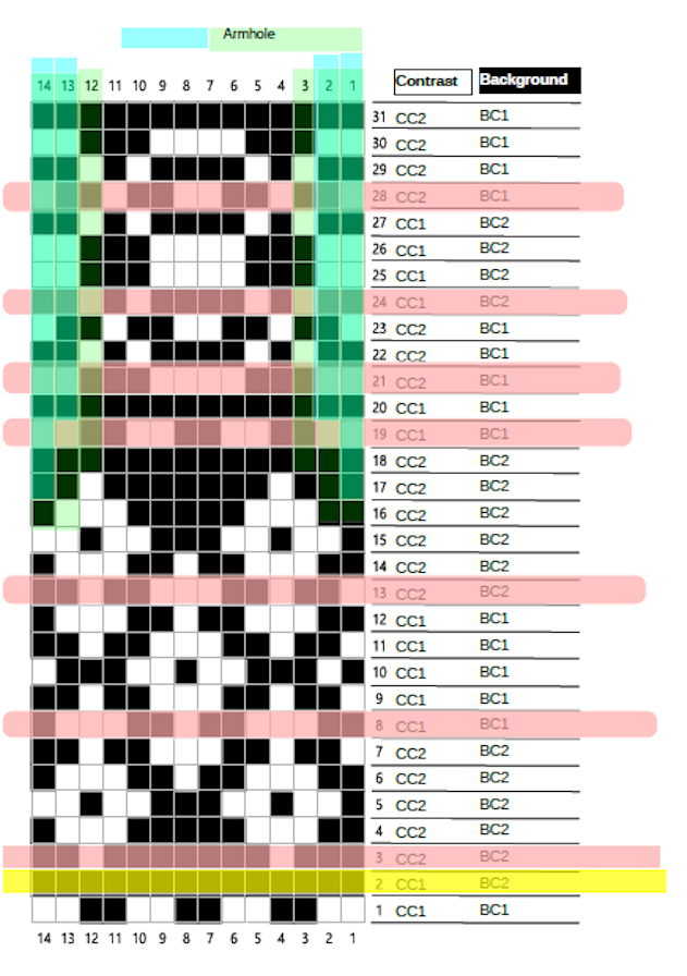
Following a chart is fairly easy while knitting the body of a sweater in the round – you start each round at the same column. As soon as you start the decreases for an armhole you need to start at a different column following each decrease.
Although you can work this out each time you start (and finish) to knit each round, I find that it is easier to highlight the start of each round on the chart before I start – as I have done in the chart on the left (the light green shading).
The chart also shows the rows where I need to remember to change colours.
Helpful links
- T-ref: Reading knitting charts
- How to read colour charts for knitting.